Tuesday, November 6, 2012

A Little Election Day Eye Candy

I am so looking forward to the end of the election season. The Facebook political posts, the incessant ads, the campaign sign litter. It seems that not only does everyone have an opinion, but they feel the need to share it and stubbornly defend it...often stepping way past the boundaries of civility in the process. Naturally, the best way I could think of to escape it was to take a look at some political houses. Care to join me?

Former President Bill and Secretary of State Hilary Clinton call this classic home in the Kalorama neighborhood of Washington, DC, home. The timeless "five over four and a door" house is one of my favorite styles. 

Former Vice President Gore calls this Nashville mansion home. The columned portico and white clapboards are pure southern.

The first President Bush calls this seaside charmer home. In Kennebunkport, Maine, the house enjoys panoramic water views. 

Hickory Hill, in McLean, Virginia, was briefly home to JFK. He sold it to his brother Robert, and he and Mrs. Ethel Kennedy raised their family there. Restrained and elegant, the symmetrical core has been added to several times over the years.

 Finally, we get to the homes of the two candidates currently vying for the White House. This brick house is the Chicago home of Barack and Michelle Obama. The heavy cast stone window heads and door surround make the house feel a bit like an old school to me. Presidential types must love symmetry!

The home that Mitt and Ann Romney shared for many years is somewhat reminiscent of Hickory Hill--a classically proportioned center flanked by wings added later on. I love how the garage addition has barn-like detailing. 

Lastly, another former Romney house. This one is in Utah, no doubt used when Mitt was running the winter Olympics there. Massive and rambling, I adore how the house steps down the hillside. Had to be quite a challenge to design and build!

So there you have it...that's as political as we're going to get at Southgate. Do you have a favorite political house? We'd love to hear about it in the comments!

Join us on Facebook!

Thursday, November 1, 2012

Going Up

I've got three similar projects on the boards right now, second floor additions to one story homes. The wish lists for all three are similar: create a proper master suite on the first floor, and add two bedrooms and a rec room on the new second floor.

The first house is a simple ranch, about 1,600 square feet. The current owners renovated when they first bought the house, and weren't keen on tearing out all of their work to make the renovations happen. So other than expanding one of the original bedrooms for use as a dining room, the original interior was left untouched. A new master suite, large outdoor living area, and garage are added out back, and a large front porch will be a great place to watch the neighbors go by. In the new second floor, two bedroom suites are on either side of a large playroom, and there's even room for some future expansion over the new garage.(For "After" Pictures of this house, CLICK HERE)

The second house is a similar unassuming ranch house. The existing interior was in need of updates, but since there was a little more square footage, we were able to keep the existing footprint. Two of the original bedrooms and the original master bath were gutted on the main floor--combined into a modern suite with a proper master bath and walk in closets. A few walls were felled in the rear of the house, allowing a large redesigned kitchen to open up to the family room. Upstairs, the kids will enjoy large bedrooms, walk in closets, and share a large compartmented bath. From the street, the steeper roof and dormers give the old ranch a cottage appearance.

The final house is the oldest of the three...a cute shingled cottage on the edge of a fine neighborhood of classic old homes. Tired and somewhat neglected, the old gal is in need of more space and some TLC. The interior will be gutted, the rabbit warren of small rooms giving way to an open floor plan that will feel much larger than it is. A new master suite and laundry room will be added at the rear, and upstairs two bedrooms will share a hall bath, and a large media room will overlook the back yard. The swooping roofline keeps the cottage character of the neighborhood and creates a larger front porch.

Do you have a favorite? Weigh in here! And stay tuned for more photos as work gets underway.

Thursday, October 25, 2012

TV and Movie Houses: The Golden Girls

One of my favorite all-time TV shows is The Golden Girls--the story of four ladies sharing a house, and a lot of laughs,  in Miami. NBC ran the show from 1985 til 1992 and while skeptics initially thought America wouldn't tune in to see a show about older women, it was in the top 10 for six of its seven seasons and won numerous Emmys. The show tackled some tough issues--from the (then relatively new) AIDS crisis, to the Cold War (which was just ending as the show began).

Sadly, of the four main characters, only Betty White is still with us. Each of the four women, in real life and in character, are fascinating and I could go on about them for pages. But, this being a design blog, I'll instead tackle the silent fifth star of the show--the Golden Girls' house. From the pilot episode, the house was an integral part of many plotlines. There were episodes that centered around the leaking roof, the garage renovation, the bathroom remodel, unsolicited offers to purchase it, and neighborly disputes over felled trees.

The exterior of the house is typical of the sort of ranch house that might have been built in Florida or California during the 70's--a long, rambling thing with a low pitched roof and a vaguely Polynesian flavor. While Blanche, Dorothy, Rose, and Sophia were said to live at 6151 Richmond Street in Miami, the REAL house used for the exterior shots is located at 245 N Saltair Ave in Brentwood, California.
Blanche owns the house for most of the series (in a later episode, she retitles the house in ALL of their names to avoid bureaucracy regarding tenants), having lived there with her late husband George. We know most of the furniture and decorating decisions were hers, because the house looks virtually the same during the pilot episode as it does throughout the show.
In one memorable scene, Blanche returns home with one of her many gentleman callers and trips the newly installed burglar alarm. Rose, who has been traumatized by an earlier robbery, fires a shot into the living room, ruining a cloisonne style vase that sat by the front door. Rose apologizes, pointing out that "At least I didn't shoot Lester!" but Blanche retorts "I'd rather you shot Lester!" while Sophia hides fragments of the vase in a potted plant to prevent Blanche repairing it.

A glimpse of the front entrance of the house...including Blanche's beloved vase (pronounced "vozzz", natch)
Much of the show's action takes place right here, in the girls' living room. The distressed wood doors throughout the house now look fresh again--Restoration Hardware has built whole collections around wood pieces with a similar finish. The furniture screams "80s"...rattan everything, peaches and teals. and the odd sprinkling of French style fautilles. Sophia once advised Blanche, "NO MORE WICKER!" and I have to agree!
The rear of the living room features a wall of glass overlooking the lanai, vaulted and skylit ceilings, and a fireplace. With some new furniture, I think this could be a very dynamic space.
How many cheesecakes were devoured around that kitchen table? (I just noticed those Chinese Chippendale chairs! Give those puppies a new coat of paint and some snazzy upholstery and they could be awesome!) The oak cabinetry, muted earth tone wallpaper, and butcher block counters are all children of the 80's...and the harvest gold wall phone looks to be leftover from the 70s. The wallpaper in this picture is the second used during the show. It replaced a small floral pattern in a similar color. The Golden Girls were not the first TV family to use this particular kitchen, though. In the short lived ABC series "It Takes Two" (from the 82-83 season), this same set was used in the home of its main characters.


  In one episode, the ladies set about replacing the toilet in this bright and spacious bathroom. Hilarity ensues, of course, but eventually they get it all put back together. Check out those colors! Teal and pink tiles cover the walls, and that hot pink shower curtain---have mercy! But the wall of glass overlooking a small walled garden and overall size of this bathroom make it memorable. Updated with a few acres of marble, this bath could be amazing.


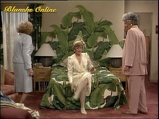
Blanche's bedroom might as well be wearing shoulder pads it is such an 80's icon. Mauve wall to wall carpet, green laminate furniture, and a forest of palm leaves combine beneath her mirrored ceiling. But imagine that palm print by itself. Does it look familiar? It's a pattern designed in 1942 by legendary decorator Dorothy Draper called "Martinique" and has been a signature item at the Beverly Hills Hotel. Nate Berkus used it in his own dining room in Milan, and Nikki Hilton has apparently used it in her house. It's still available and when seen without the 80's colors Blanche had, makes a real retro-glam statement.

We rarely see the other girl's rooms, but in this episode Dorothy and her sister Gloria catch up in hers. The thin metal framed artwork over the bed is typical of what hangs on the walls throughout...and her headboard reveals that the wicker isn't confined to the living room. The glimpses of the secondary bedrooms indicate that they are all large enough to accomodate a sitting area in addition to the usual sleeping functions, which has made me think the Golden Girls house might be a perfect floor plan for the increasing number of multi-generational households.

A number of people online  have attempted to recreate the floor plan. It's no easy task...as with many sets, there are a lot of things that just don't jive. The plan above takes some liberties, but attempts to marry the plan to the elevation we are all used to. It also puts Blanche's room back at the front of the house, where it appeared in some of the first episodes.

While very similar to the first plan, I think this one captures the dynamic living room better. Again, Blanche's room is at the front of the house. I could see this plan working very well with a few tweaks. I'd give each bedroom it's own bath, and open the kitchen up to the living area, but otherwise it's pretty solid as it is.

Are you a fan of the Golden Girls? What were some of your favorite moments from the show? What suggestions do you have for the floor plan?

Join us on Facebook!

Wednesday, October 17, 2012

It's The Great Pumpkin (colored room) Charlie Brown

Fall is my favorite time of year...when cool temperatures bring relief to the heat of summer, the trees unleash a canvas of color, and nothing sounds better than curling up under a blanket with a cup of cider and a good book. I'm also drawn to the colors of fall--deep browns, warm oranges, and earthy yellows. The heart of our house is decked out in a harvest color scheme--orange tweeds mix with brown leather and harvest colored stripes in the great room, and the orange is carried onto the walls of the adjoining kitchen and morning room. Now, I've often questioned the decision of having those orange kitchen walls. Every party ends up in the kitchen, and so every single photograph that anyone has ever taken in our house is on the orange background of the kitchen. It's not always the most flattering backdrop.

But, photography issues aside, I am enjoying the resurgence orange has been seeing the past few years. The memory of the decorative horror that was the seventies meant a long hiatus for orange, but in honor of Halloween, I want to share the following orange rooms that show just how versatile and dramatic the color can be.

An orange runner and painted stripe punctuate an otherwise monochromatic foyer.

A deep spice orange gives warmth to this study. (Love the graphic artwork over the loveseat!)

Orange is right at home in a contemporary setting too. Here, it has been used as a graphic accent over a bed.

Pumpkin color walls and matching draperies with gorgeous tassel trim make this room warm and inviting.

In this crisp bathroom, a bright orange paint repeats one of the colors from the tile wall, bringing warmth and depth to a room whose clean lines might look cold with a more neutral color scheme.

Glossy light orange walls are a great backdrop for the graphic art in this foyer. The striped vestibule makes this space feel like a chic Tim Burton set.

 The peachy orange walls of this traditional foyer show just how versatile shades of orange can be.

And finally, this gorgeous foyer. If your neighbor said they were painting their foyer orange and black, would you ever dream the result would be this elegant? The black trim really makes the spice orange walls POP, and the color gives the botanical gallery weight--those prints would feel lost on a beige wall.


Tuesday, October 16, 2012

Amazing Garages

If there's anything I like better than design, it's cars. So this is a topic dear to my heart: dream garages. Full disclosure: I don't have one of these. My garage is like most everyone's: every corner crammed with tools, paint cans, and leftover odd bits and items making their way to the trashcan or the local Goodwill. Oh, and just enough room to squeeze our two cars in among it all.

But I can dream...

This garage apparently has space for 32 cars. Swoon. It's as if each car has it's own little cabana.

I picture this one filling out one end of a handsome country estate..probably filled with vintage British cars.

A single garage door leads to subterranean parking for multiple supercars. It's design is as subtle as it's inhabitants are flashy. 

Here, the Ferrari is right at home alongside a wet bar and a seating area. Polished, stained concrete, and a hand knotted rug IN THE GARAGE. Posh!

Another car sharing the living space. The Maserati almost feels like a piece of sculpture in the sleek, restrained surroundings.

An earlier picture of the same space...Notice how the floor tilts up to roll the car out.

Absolutely over the top garage. Could double, if needed, as a hotel ballroom. Haha!

A tumbled stone floor, stone walls, and wood beamed ceilings show that this garage was given as much attention as any other space in the house.

The ultimate home for a car collection--a Vegas inspired showplace with double decker car lifts and bold colors.

This vintage space has plenty of storage and an antique gas pump for each bay.

A masculine garage with handmade wood casework. 

So which one is your favorite? Is your garage a mess of boxes or a showplace for your autos? (Bonus points if you can still get your cars in the garage!) 

Join us on Facebook!

Friday, September 7, 2012

The Fairview

The Fairview is a new pre-designed plan in the Southgate collection. It actually began several years ago as a "napkin sketch" study for an infill lot on one of the finest streets of old homes in the upstate. The exterior is brick, with cast stone watertables at the base and to delineate between levels. Detailing is restrained, but handsome. The house is perfect for the sort of neighborhood it was originally conceived for, but would also be right at home in a newer subdivision.

 Cast stone details are used sparingly, giving the house a timeless quality that doesn't rely on faddish architectural gimmicks. Gables can be either cast stone panels or stucco scored to look like limestone. 

The main floor encompasses just over 2100 square feet and features both formal and informal living and dining spaces along with a comfortable study and a spacious kitchen. Large arches open the floor plan, allowing light to cross throughout and insuring perfect flow for entertaining.

The second floor offers 1800 square feet of private space. Three family bedrooms are located at the front of the house, two have private baths and walk-in closets, while the third accesses a hall bath. The master suite, at the rear of the house, overlooks the courtyard below, and features a stunning bathroom with groin vaulted ceiling and to-die-for walk in closet.

As always, we would love to hear your feedback!

Join us on Facebook!

Monday, September 3, 2012

White on White

One of the most difficult designs to pull off (and I imagine most designers and DIY'ers would agree) is one that would appear to be easiest--white on white. Any monochromatic palette presents challenges, but white on white is the hardest. As anyone who has seen a wall of paint chips knows, there are a million "whites"...place two of them together and suddenly one turns pink, and the other blue. Even two seemingly identical whites aren't once texture and light come into play. Pulling together a white on white room is difficult...but absolutely stunning when it's done correctly. The play of textures, the nuances of pattern, and the way light works off the surfaces make for a very rich space.

So here's a look at ten white rooms that work:

The glossy white tongue and groove ceiling is an unexpected touch in this soothing bedroom. The simply trimmed drapes and textured shades give the room depth.

Dark floors are often the perfect anchor for an all white room, as they are in this space.

The texture of the tiles, artful use of tile moldings, and silver-finished plumbing fixtures make this an amazing bathroom.

What a restful bedroom! The dark nightstands and drapery hardware provide definition and the layered textures give it depth.

What a great mix of furnishings in this space!

Subtle variation of tones make this calming bedroom a stunner.

Luxe living in a small space...beautiful details, heavily veined marble, and liberal use of mirrors makes this apartment glamorous and elegant.

 A mirrored mantel, clever wall of storage hidden behind drapery, and an eye-catching tete-a-tete make this waterfront room memorable.

Notice the dark painted ceiling in this monochrome room. The ethereal drapes provide shimmer and light control.

Classical pieces of furniture feel fresh and new in white fabrics, and the layered patterns in the room make it timeless.

Join us on Facebook!