Showing posts with label TV/Movie Houses. Show all posts

Thursday, October 25, 2012

TV and Movie Houses: The Golden Girls

One of my favorite all-time TV shows is The Golden Girls--the story of four ladies sharing a house, and a lot of laughs,  in Miami. NBC ran the show from 1985 til 1992 and while skeptics initially thought America wouldn't tune in to see a show about older women, it was in the top 10 for six of its seven seasons and won numerous Emmys. The show tackled some tough issues--from the (then relatively new) AIDS crisis, to the Cold War (which was just ending as the show began).

Sadly, of the four main characters, only Betty White is still with us. Each of the four women, in real life and in character, are fascinating and I could go on about them for pages. But, this being a design blog, I'll instead tackle the silent fifth star of the show--the Golden Girls' house. From the pilot episode, the house was an integral part of many plotlines. There were episodes that centered around the leaking roof, the garage renovation, the bathroom remodel, unsolicited offers to purchase it, and neighborly disputes over felled trees.

The exterior of the house is typical of the sort of ranch house that might have been built in Florida or California during the 70's--a long, rambling thing with a low pitched roof and a vaguely Polynesian flavor. While Blanche, Dorothy, Rose, and Sophia were said to live at 6151 Richmond Street in Miami, the REAL house used for the exterior shots is located at 245 N Saltair Ave in Brentwood, California.
Blanche owns the house for most of the series (in a later episode, she retitles the house in ALL of their names to avoid bureaucracy regarding tenants), having lived there with her late husband George. We know most of the furniture and decorating decisions were hers, because the house looks virtually the same during the pilot episode as it does throughout the show.
In one memorable scene, Blanche returns home with one of her many gentleman callers and trips the newly installed burglar alarm. Rose, who has been traumatized by an earlier robbery, fires a shot into the living room, ruining a cloisonne style vase that sat by the front door. Rose apologizes, pointing out that "At least I didn't shoot Lester!" but Blanche retorts "I'd rather you shot Lester!" while Sophia hides fragments of the vase in a potted plant to prevent Blanche repairing it.

A glimpse of the front entrance of the house...including Blanche's beloved vase (pronounced "vozzz", natch)
Much of the show's action takes place right here, in the girls' living room. The distressed wood doors throughout the house now look fresh again--Restoration Hardware has built whole collections around wood pieces with a similar finish. The furniture screams "80s"...rattan everything, peaches and teals. and the odd sprinkling of French style fautilles. Sophia once advised Blanche, "NO MORE WICKER!" and I have to agree!
The rear of the living room features a wall of glass overlooking the lanai, vaulted and skylit ceilings, and a fireplace. With some new furniture, I think this could be a very dynamic space.
How many cheesecakes were devoured around that kitchen table? (I just noticed those Chinese Chippendale chairs! Give those puppies a new coat of paint and some snazzy upholstery and they could be awesome!) The oak cabinetry, muted earth tone wallpaper, and butcher block counters are all children of the 80's...and the harvest gold wall phone looks to be leftover from the 70s. The wallpaper in this picture is the second used during the show. It replaced a small floral pattern in a similar color. The Golden Girls were not the first TV family to use this particular kitchen, though. In the short lived ABC series "It Takes Two" (from the 82-83 season), this same set was used in the home of its main characters.


  In one episode, the ladies set about replacing the toilet in this bright and spacious bathroom. Hilarity ensues, of course, but eventually they get it all put back together. Check out those colors! Teal and pink tiles cover the walls, and that hot pink shower curtain---have mercy! But the wall of glass overlooking a small walled garden and overall size of this bathroom make it memorable. Updated with a few acres of marble, this bath could be amazing.

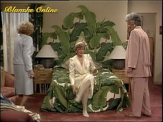
Blanche's bedroom might as well be wearing shoulder pads it is such an 80's icon. Mauve wall to wall carpet, green laminate furniture, and a forest of palm leaves combine beneath her mirrored ceiling. But imagine that palm print by itself. Does it look familiar? It's a pattern designed in 1942 by legendary decorator Dorothy Draper called "Martinique" and has been a signature item at the Beverly Hills Hotel. Nate Berkus used it in his own dining room in Milan, and Nikki Hilton has apparently used it in her house. It's still available and when seen without the 80's colors Blanche had, makes a real retro-glam statement.

We rarely see the other girl's rooms, but in this episode Dorothy and her sister Gloria catch up in hers. The thin metal framed artwork over the bed is typical of what hangs on the walls throughout...and her headboard reveals that the wicker isn't confined to the living room. The glimpses of the secondary bedrooms indicate that they are all large enough to accomodate a sitting area in addition to the usual sleeping functions, which has made me think the Golden Girls house might be a perfect floor plan for the increasing number of multi-generational households.

A number of people online  have attempted to recreate the floor plan. It's no easy task...as with many sets, there are a lot of things that just don't jive. The plan above takes some liberties, but attempts to marry the plan to the elevation we are all used to. It also puts Blanche's room back at the front of the house, where it appeared in some of the first episodes.

While very similar to the first plan, I think this one captures the dynamic living room better. Again, Blanche's room is at the front of the house. I could see this plan working very well with a few tweaks. I'd give each bedroom it's own bath, and open the kitchen up to the living area, but otherwise it's pretty solid as it is.

Are you a fan of the Golden Girls? What were some of your favorite moments from the show? What suggestions do you have for the floor plan?

Join us on Facebook!

Monday, April 16, 2012

The Houses of GCB

Have you seen ABC's new comedy, GCB? It's a hilarious romp through the high falutin and high drama lives of a group of Dallas ladies. High school mean girl Amanda Vaughn (Leslie Bibb) returns to Dallas following the death of her husband, a ponzi scheme crook. Annie Potts, who I grew up loving as the secretary in the "Ghostbusters" movies and as lovable divorcee Mary Jo on "Designing Women", plays Amanda's perfectly coifed, richer than rich, mother GiGi Stopper.

Neighbors and former classmates Sharon (Jennifer Aspen), Carlene (the incomparable Kristin Chenoweth), Cricket (Miriam Shor), and Heather (Marisol Nichols) round out the talented cast. The show is set in Dallas' Highland Park neighborhood, and all the ladies live in houses the size of a boutique hotel.

The sets were designed by Denny Dugally and Bryan Venegas, the duo responsible for the sublime Walker residence on the sadly defunct "Brothers and Sisters" that previously held "GCB's" time slot. While none of the GCB sets speak to me the way Nora Walker's Pasadena mansion did, the team did a fantastic job on them. Let's take a look:


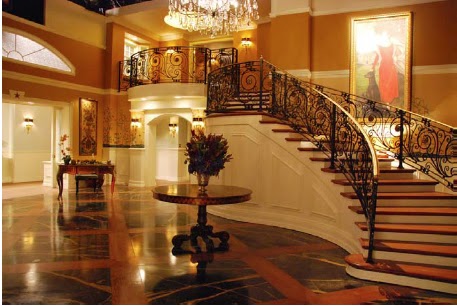
Gigi's foyer is the size of most suburban homes. The dramatic stairs, acres of marble, and of course a larger than life oil painting of the lady of the house, make it an entrance to remember.


Gigi's trophy room. The armory of guns make sure she isn't afraid of "a damn thing."


Carlene's living room is gorgeous. Dramatic dark walls serve as a backdrop for pops of vibrant red.


And Carlene's bedroom is equally striking, with its eggplant walls, high canopied bed, and family-room sized sitting area.


Sharon has recently started a food company that specializes in Bible-based cuisine. No surprise then that her southern kitchen is a gourmet's dream come true.


Tough as nails Cricket gets a Texas modern retreat from her corporate world. Her bed is enormous! (She and her hunky hubby probably aren't spending much time cuddled up in it.)


The sitting area of Cricket's bedroom. Stone and storefront glass combine for a sleek but comfortable look.


And her office has a telling set of framed shark jaws above the desk. Cool, slick, and tailored, just like the character it was designed for.

We've yet to see down-to-earth Heather's house. I picture her living in a comfortable contemporary loft or a transitional styled townhome. Of course, she hopes to snag herself a deep-pocketed husband, so we might see her moving into a Highland Park mansion too.

So, whose house is your favorite? Do you think the designers did the characters justice with these sets?

Join us on Facebook!

Tuesday, August 2, 2011

TV/Movie Houses: Bill Compton's Mansion on "True Blood"

Are you a fan of "True Blood?" I have to confess that it's one of my guilty pleasures. The books are the sort of mindless easy reading I love to have on the nightstand, and the TV show carries on HBO's legacy of beautifully produced television.

This season, one of the main characters, Bill Compton, a vampire who has been on the earth since the time of the Civil War, has become the Vampire King of Louisiana. So that he has a home befitting his new status, Bill remodels the antebellum house that has been in his family for generations. The set decorators gave us a video tour over on HBO (check it out HERE) and explained Bill's new digs.

When the series started, Bill's house is timeworn, having been abandoned for many years. In the books, Sookie (the main character for those of you who aren't True Blood fans) helps Bill with construction arrangements (since he can't very well be out and about during the day). Here are a few shots of what Bill's house looked like originally:

Notice the peeling paint and the general feeling of neglect.


Someone had their work cut out for them!


But check out the afters...absolutely delicious:

The master bedroom is very masculine. Dark colors, geometric patterns, and drapery made from men's suiting material. The red rug provides a dash of color, and I can't help but wonder if it's an allusion to the show's title.


Another shot of Bill's bedroom. Throughout this set, the designers have done something that I absolutely love--mixed traditional pieces and architecture with more modern ones. Makes for a very sophisticated look.

Very traditional paneling pays homage to the house's antebellum roots. The light fixture here feels like an abstracted version of an antique chandlier.


Bill's office is to die for (no vampire pun intended.) The muted, masculine color palette, the built in bookshelves, the blingy light fixtures...swoon!

Now I know quite a few people are looking at this photo and thinking "what office?" But look past the handsome vampires and dig the art he has. The tone one tone wallpaper. The chrome bits. All mixed in with a traditional globe and chest. If "Frasier" had premiered in 2011, I can't help think the set would look a lot like this.

The foyer continues the theme. Very traditional architecture paired with fine items from a variety of eras. I just love it!


That living room from the first photo looks quite a bit different here! The neutral colors let the lines and texture of the furniture make the statement. The black mantel, detail on the drapes, and framework on the wingback chairs give the room some punch.

The set designers accomplished something that is somewhat difficult. It's quite hard to design a space as polished as this one and have it come off so distinctly masculine. Too often, cliched themes (hunt club, anyone?) creep into the design of men's spaces...but they have created an urbane and sophisticated house that I, for one, could move right into.

Join us on Facebook!


Monday, May 30, 2011

The McAllister--a New Pre-Designed Plan

For all you movie buffs out there, the newest plan in our portfolio of pre-designed houses might look familiar.
When the real house from the movie "Home Alone" hit the market recently, the internet and blogs were abuzz with photos and information on the house in Winnetka, Illinois. It seems the classicly styled house had captured the hearts of many. And, it's easy to see why. The curb appeal is just amazing!

The real "Home Alone" house.

The interior, as recent listing information revealed, was very nice as well, but had a somewhat convoluted floor plan and was predictably lacking in closet and bathroom space demanded by modern families. (The original house was built in 1920, afterall.)

So we have created the modern version of the house, keeping the curb appeal that makes it so timeless, and incorporating a floor plan that's more satisfying to the way we live now:
The Front of our "McAllister"
The Main Floor of our McAllister Plan. Incorporates formal living and dining rooms, but the wonderful open floor plan, with circular traffic flow, is an entertainer's dream! the gourmet kitchen opens to the principal living areas, and the inclusion of an attached garage is a welcome convenience.
Upstairs, four bedrooms provide plenty of room for family and guests. All of the bedrooms are generously sized. One of the secondary bedrooms has a private bath, while the other two share a generous hall bath. The master suite is pure luxury. An arched and paneled bed alcove, a sun-filled sitting room, and dual walk-in closets join a spa-like bathroom for a true owner's retreat.

At just under 4,000 square feet, the McAllister is a reasonably sized house, and it's simple form and graceful hipped roof make it economical to build. (Additional space could be captured in the attic if desired.) If you've always dreamed of having the "Home Alone" house for your own, now you can! Please contact us at southgateresidential@gmail.com for information on ordering these plans.

Join us on Facebook!

Sunday, May 8, 2011

That's the one Marv...That's The Silver Tuna!


By now, the listing of the "Home Alone" house has been covered in dozens of places. (Had I been able to drop what I was doing and blog about it a few days ago when a friend called to whisper that it was for sale, I would have been one of the first to do so...so a special thank you to that friend for thinking of me and my lil ole house blog.)

The "Home Alone" house is in Winnetka, Illinois--a tony northern suburb of Chicago. If you ever travel to Chicago, and are the sort of person who loves a little architectural tourism, you owe it to yourself to head north out of the city on Sheridan Avenue and just give yourself a few hours to get lost in the northern suburbs that lie just outside the city along the lakefront. (Winnetka and Glencoe standout in my mind as must-sees) These towns are chock full of exquisite residential architecture--including the "Home Alone House."

The classic red brick Georgian house was built in the 1920's, and looking at photos from the current listing and comparing it to photos from nearly 100 years ago, not much has changed outside:

But why would anyone WANT to change the exterior of this house? Georgian houses like these are my absolute favorite. There is something so solid, timeless, and undeniably "homey" about the traditional "five over four and a door" style. John Hughes probably agreed when he chose this house as home to the McAllister family in the string of Home Alone movies. If you'd like to see photos of the house from the movie, Julia at Hooked on  Houses has a wonderful collection of those images showing the house in all it's red and green wallpapered bliss, HERE. Julia also features a floorplan of the house that someone had worked up based on the movie. Compare it to this floor plan from current listing information, and you can see that the movie set very closely follows the floorplan of the real house:


Not a bad floorplan for a house that's nearing it's 100th birthday, but I think it could be better. (Maybe a new pre-designed plan from Southgate? Hmmm...) First, I hate that the laundry room is on axis with the front door. I realize that it's very unlikely that was always the laundry, but who wants company to see their dirty unmentionables lying on the floor waiting to be washed when they open the front door? Not me. It also seems to be a waste of space that the basement stair and the main stair aren't stacked on top of each other. But, overall, the plan is great. The rooms are a comfortable size, and I rather like how each room opens up to the next. if the formal living room only had an opening into the back hall where that half bath is, this home would have no "dead ends" at all, making it perfect for entertaining, and (if you ask anyone under the age of 12) even more perfect for a game of chase or hide and seek.

Something strange is going on with the second floor plan included with the listing information. Notice those closets between the master bedroom and the sunroom? They seem to show a window that would be slap-up on the corner of the house, a SIXTH window in the main block. Clearly (and thankfully) such a window does not exist. Obvious inaccuracies aside, the second floor plan reveals the master suite to be most in need of some reworking. A bedroom, a sitting room, AND a sunroom? All while the owner's of the house cram their Chicago-necessary four season wardrobe into 4 foot wide closets and attend to nature's call and groom themselves in a bathroom that looks more suited to a starter home? (A bathroom so covered in brass I can't even bear to repost the photos here.) Uh, no, ma'am. The square footage is there to make this a proper master suite, and I'd bet the ink isn't dry on the closing documents before the new owners do just that. Hopefully, while the new owners are making over the master, they'll also do something about that wonky half bath of questionable purpose that the floor plans indicate near the secondary bedrooms.


The Master Sitting Room

Master Bedroom


The most remarkable thing about the interior of the house is, well, how unremarkable it is. While the cove moldings in the foyer and the dentil molding and pilasters in the formal living room are deeee-lish-us, I honestly would have expected to see more woodwork in a house like this. The rest of the rooms are rather modestly trimmed, and frankly, a little boring. I can only assume that the current owners (who have lived in the house over 20 years, and owned it at the time it was used in the filming of Home Alone) have stripped away many of their belongings in preparation for selling the house. It just looks a bit empty, doesn't it?


That kitchen is fine as it is, but the glossy white cabinets seem a little low-buck, and while I can appreciate a hanging pot rack in SOME kitchens, the one hanging here looks more like some sort of torture device. I think finer cabinetry and detailing (like that gorgeous bordered wood floor!) would make the kitchen much better. So while I think the interior could use some updating, I imagine that any new owner who has $2.4 million to spend on it can surely afford a few hundred grand more to build on the incredible, timeless, and perfectly proportioned bones of this famous house.

Join us on Facebook!

Thursday, April 21, 2011

TV And Movie Houses: Beetlejuice

One of the most iconic movie houses (at least in  my opinion) is the Maitland-Deetz residence from Tim Burton's 1988 dark comedy, Beetlejuice. The film stars Geena Davis and Alec Baldwin as Barbara and Adam Maitland, a couple who have lovingly renovated and decorated their old Victorian home. They own the local hardware store, but in the opening scene of the film, we learn they are taking the week off to do a few projects around the house. Their love of the old Victorian is evident--their vacation gifts to one another are "Manchurian Tung Oil" and wallpaper for the guest room.

The house as it looked when the Maitlands owned it.

The local realtor, Jane Butterfield, is intent on convincing the Maitlands to sell their idyllic house. In the first minutes of the movie, she brings an unsolicited offer of $350,000 that has come from a New Yorker desperate to get away from the city. But Adam and Barbara aren't interested, of course. But it turns out that the New Yorker gets his chance after all. Adam and Barbara die in a car accident a few moments later as they head to the hardware store to get a good brush for applying the Tung Oil.

Their ghosts live on though, trapped in the house as a sort of purgatory. Their graves are still fresh when Jane sells the house to Charles and Delia Deetz, who move in with their daughter Lydia. Charles is a businessman who has suffered some sort of mental breakdown, Delia is an aspiring sculptor and artist, and Lydia is a brooding "goth" teenager.

Delia, played by the wonderful Catherine O'Hara, is a snobby fashionista who finds the house utterly unlivable. Her decorator, Otho, is an overweight and pretentious man, and he consents to leave the city to assist with the redesign she feels the house needs. The contemp they hold for the house is obvious as they walk through it on move-in day.

"Well deliver me from L.L. Bean." Otho quips with a roll of the eyes. The house's lack of "organic flow through" doesn't sit well with him, and he warns Charles that the renovations are going to cost him big.

The rest of the movie is a hilarious romp as the Maitland's ghosts attempt to get the Deetz family OUT of their house. The ensemble cast plays their parts perfectly, but the real star of course is the house. Had the Maitlands not loved the house so much, and if the two families taste had been more in line, there wouldn't have been a story! And their tastes could not have been more different! Take a look:


I have to assume the Maitlands hadn't gotten around to doing a lot to the exterior before they died. It's perfectly charming, but more than a little timeworn.

An army of workers arrive with the Deetz, transforming the house into a Post Modern monstrosity.

The house as the Deetz (with Otho's  help of course) redesigned it. I've always thought the exterior was rather interesting this way. The style is pure 80's, but looking at it now, it really doesn't seem that dated. I like how the "bones" of the original house are still there and visible and the modern elements have been applied almost like an exoskeleton. The striped bands at the base of the house are a Tim Burton signature!

The Deetz' new porch wouldn't pass any building codes I'm aware of! Up close, it appears the stripes are bands of shingles. While I can appreciate what they did outside, the interior is a different story...

Here, we catch a glimpse of the kitchen as the Maitlands had it. Painted cupboards, a soft green on paneled walls, and a checkerboard backsplash--pure country house!

The Deetz' kitchen is a nerve-wracking combination of glass block and acid blue. I'd need a big glass of merlot to calm my nerves if I were in this room.

The Maitland's ghosts see their remodeled house for the first time. Otho and Delia have painted every surface in dark faux-finishes, and stripped much of the original details in favor of post modern pieces like this mantel with a lighted hearth.

Otho stands inside of his creation with Lydia. I actually like the abstract painting, but the fleck-painted walls and moldings, not so much.

The Deetz' dining room, with horrible faux-marble paintjob, is severe to say the least. A glass atrium at the rear of the room showcases Delia's sculptures--which are wrapped in glass block and sitting on a floor of white sand. The jagged stone slab that makes up the table is very cold looking, and those strange chairs couldn't possibly be comfortable!

In the foyer, Delia and Otho have once again painted everything in a monochromatic gray faux finish. This room looks like it has heavy smoke damage to me! In one scene, the snakeskin covered handrail turns into a real snake that attacks Delia.

At the end of the movie, Adam and Barbara come to an agreement that allows them to live peacefully with the Deetz family. They begin renovating the house BACK to the way they had it. Here, we can see they've got a bit more to do to restore the foyer.

There is no "real" Beetlejuice house. The exterior was just a shell built for filming on a hill overlooking East Corinth, Vermont. The interiors were built on a soundstage and were designed by set decorator Catherine Mann, who did a handful of late 1980's movies. As an interesting aside, the actor who played Otho (Glenn Shadix) moved back to his hometown of Bessemer, Alabama in 2007 and purchased a white Victorian built in 1886 that bore some similarity to the Maitland house. Unfortunately, his Victorian was destroyed by fire in 2008, and Shadix  himself passed away in 2010.

Join us on Facebook!