Sunday, July 29, 2012

If You Have To Do Laundry...

wouldn't doing it in one of these rooms make the chore so much easier?

Plenty of cabinet space, classic subway tile, natural light, and a gift wrapping station.
I love the idea of a countertop over the washer and drier--provides a great folding area, particularly in 
smaller laundry rooms.

Isn't this a neat idea? An old metal tub repurposed as a laundry sink. The hand shower mounted above
means this would be a great place for washing pets!

More and more houses are incorporating the laundry facilities into a "family studio" 
like this one. Part home office, part craft room, and part laundry room. 

What a perfect cottage laundry room. Countertops over the appliances, a charming sink, and a nice looking combination of open shelves and cupboards.

Multiple appliances mean knocking out the weekly laundry that much faster. The trestle table is a great spot for folding and the built in ironing board means no more lugging a squeaky board out.

So what's in your dream laundry room? For me, I'd have room for two washers and two driers, some area for hanging, a big surface for folding, and some sort of bins or hampers for sorting. Built in ironing (or better yet, one of those steamers that makes ironing almost unneccesary), and enough cabinet space to hide all the soaps and softeners.

Join us on Facebook!

Saturday, June 30, 2012

DIY Tiered Planters

For the past two summers, we have been on the lookout for some tall planters to put on either side of our front door. The ones we wanted were ridiculously expensive, and even everything we found that was "good enough" was over $100--which seemed way too much to pay for a resin planter.

Then a friend mentioned a project she had seen on Pinterest...a stack of plain old terra cotta pots, filled with plants. It seemed like a simple idea, so we decided to give it a try. In the end, they turned out fantastically...and we spent less than $100 total, including all the plants and soil!

The finished product!

The project was simple enough. We bought four sizes of terra cotta pots. The bottom one was an azalea pot...shorter in proportion then the others, and made for a great base. We wanted the pots to match our black shutters and door, so a quick coat of spray paint did the trick.

Starting at the bottom, we filled the pot with dirt, stopping a few inches shy of the top, and tamped it down by hand. We then stacked the next pot, pressing it into the dirt below until it was centered, level, and stable. Then just repeated the process until we got to the top. 

Then we filled the top with spikey decorative grasses and coleus, and filled in the levels below with creeping jenny, impatiens, and begonias. They filled in beautifully, and are now so full that the pots themselves are practically invisible...just a cascade of blooms and greenery. One thing we wish we had done was put the planters on some sort of casters. It would be nice to be able to move them to clean underneath. Otherwise, they turned out great! (Just pretend the welcome mat is turned the right way, won't you?)


Thursday, May 31, 2012

Designing in 3D

One of the challenges designers and architects face has always been how to give their clients a true feeling for the spaces they are designing. It's difficult for most people to envision a house and its rooms from flat images on a screen or paper. To show them the spaces in 3D is much more meaningful.

In the past, that meant real scale models--beautiful handcrafted representations of the proposed house made of wood, metal, and plastic. Architectural models are an artwork all to themselves--but very time intensive. They simply aren't feasible for the average renovation or even practical on a multi-million dollar custom house.

For years, there have been programs (AutoCAD architectural desktop, Revit, etc.) that could be used to generate accurate and meaningful computerized models of spaces. But those programs are relatively complex, and again, the time required to use them properly is prohibitively expensive on most residential projects.

Enter Sketch Up, a Google product that has relatively quickly become an indispensable tool for designers. A free version that offers most of the programs capabilities can be downloaded by anyone. Relatively intuitive, with online guides that easily explain the more complex commands, the program offers the benefits of 3-D design in a fraction of the time other methods take. The professional version is very reasonably priced, and offers added goodies and compatibility with autoCAD (the standard program for design and drafting). Users of either version can take advantage of Google's 3D Warehouse--where virtually any item you might find in a home is available for download.

The uses of Sketch Up are many--the entire house can be drawn in 3D, right down to the door casings and sink faucets, or it can be used to quickly explore massing, or to figure out a tricky roof intersection. Here are some examples of how I've used it:

A fully detailed Sketch Up model, complete with all the trimwork and landscaping.
The real house for comparison.

3D image of my foyer

and the real foyer, from a slightly different angle.

Here, I wanted to get a feel for what a few changes to a set of plans I was working on was going to do to the "look" of the house. A few hours time gave me this "quick and dirty" 3D model. No interior on this one, and the other sides of the house aren't detailed, but this was a great tool for getting the scale of a few features right.

Here's a fully detailed interior space. While not useful for deciding between subtly different shades, models like these are perfect for getting a feel for the general direction of a color scheme.
And thanks to the library of items in the 3D Warehouse, rooms can be quickly furnished.

Look intriguing? Well head over to Google and download your free version of Sketch Up...it's easy to learn, fun to play with, and will prove itself useful for a variety of projects around the house.

Join Us on Facebook!


Sunday, April 29, 2012

Good Eats: Feta-Avocado Salsa


 Last night we hosted a fundraising dinner that is part of a local charity's annual "Dining With Friends" drive. The idea, at least originally, was that groups of friends would get together at each others homes for dinner and then all of the individual dinner parties would come together at one final party, The Red Party, for desserts, drinks, and dancing. As the event has grown, many people host their dinners ahead of the main event, which is what we opted to do. The theme for this year's Red Party is "Salsa!" (as in the dance, not the dish.) We played off of that theme and had an entree bar with various meats, cheeses, and shells, Spanish rice, re-fried and black beans, and a host of Mexican appetizers. One of the biggest "hits" was this super easy dish, that is great with pita triangles or plain old tortilla chips. Thanks go to one of my neighbors for sharing this recipe with me a while back! The amount here is perfect for dinner with a few couples, and can easily be multiplied for larger gatherings.


Feta-Avocado Salsa
4 plum tomatoes, chopped
2 Tablespoons Red Onion, finely chopped
3 Tablespoons Red Wine Vinegar
2 Tablespoons Olive Oil
2 Cloves Garlic, minced
2 Tablespoons parsley, chopped
4 oz. crumbled feta cheese
½ Teaspoon salt
½ Teaspoon oregano
2 avocados, chopped
Mix all ingredients except avocado together. Just before serving, add the avocado.

Join us on Facebook!

Monday, April 16, 2012

The Houses of GCB

Have you seen ABC's new comedy, GCB? It's a hilarious romp through the high falutin and high drama lives of a group of Dallas ladies. High school mean girl Amanda Vaughn (Leslie Bibb) returns to Dallas following the death of her husband, a ponzi scheme crook. Annie Potts, who I grew up loving as the secretary in the "Ghostbusters" movies and as lovable divorcee Mary Jo on "Designing Women", plays Amanda's perfectly coifed, richer than rich, mother GiGi Stopper.

Neighbors and former classmates Sharon (Jennifer Aspen), Carlene (the incomparable Kristin Chenoweth), Cricket (Miriam Shor), and Heather (Marisol Nichols) round out the talented cast. The show is set in Dallas' Highland Park neighborhood, and all the ladies live in houses the size of a boutique hotel.

The sets were designed by Denny Dugally and Bryan Venegas, the duo responsible for the sublime Walker residence on the sadly defunct "Brothers and Sisters" that previously held "GCB's" time slot. While none of the GCB sets speak to me the way Nora Walker's Pasadena mansion did, the team did a fantastic job on them. Let's take a look:


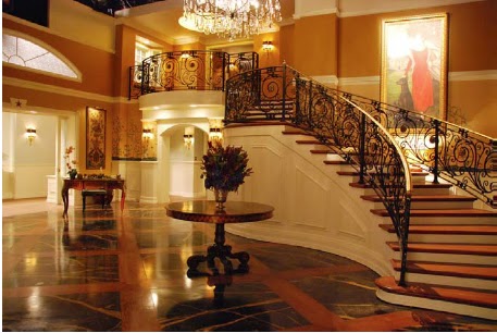
Gigi's foyer is the size of most suburban homes. The dramatic stairs, acres of marble, and of course a larger than life oil painting of the lady of the house, make it an entrance to remember.


Gigi's trophy room. The armory of guns make sure she isn't afraid of "a damn thing."


Carlene's living room is gorgeous. Dramatic dark walls serve as a backdrop for pops of vibrant red.


And Carlene's bedroom is equally striking, with its eggplant walls, high canopied bed, and family-room sized sitting area.


Sharon has recently started a food company that specializes in Bible-based cuisine. No surprise then that her southern kitchen is a gourmet's dream come true.


Tough as nails Cricket gets a Texas modern retreat from her corporate world. Her bed is enormous! (She and her hunky hubby probably aren't spending much time cuddled up in it.)


The sitting area of Cricket's bedroom. Stone and storefront glass combine for a sleek but comfortable look.


And her office has a telling set of framed shark jaws above the desk. Cool, slick, and tailored, just like the character it was designed for.

We've yet to see down-to-earth Heather's house. I picture her living in a comfortable contemporary loft or a transitional styled townhome. Of course, she hopes to snag herself a deep-pocketed husband, so we might see her moving into a Highland Park mansion too.

So, whose house is your favorite? Do you think the designers did the characters justice with these sets?

Join us on Facebook!

Wednesday, April 11, 2012

In The Works

I'm working with a repeat client on the interiors of a newly purchased condo at the beach. First up are the two guest rooms, which we have outfitted with pieces from Lexington's Tommy Bahama collections.

In one guest room, we picked this bed and nightstands, from the Ocean Club collection:


The tall headboard makes quite a statement, so my thought is that there won't be a need for much pattern or color. The sheeting and top of bed coverlet will likely be white. When the owner's parents visit, this will be their room, and they like yellows. So here are a few choices for fabrics:


The top image shows one fabric in it's full width. Beautiful colors and depth of pattern, but may be too much for this space, even if we used it just for a couple of shams. The lower image is a cabana stripe with cording that repeats the reds and blues in the print. I imagine using it for the drapery.

An alternate for the same room would be to go even less bold. Crisp white bedding, a solid but textural fabric for the drapes (such as the nubby deliciousness on the left) and a small geometric for pillows and banding (either of the choices on the right). I'm leaning in this directon versus the top choices.


The second guest room has the opportunity for more pattern and color. We'll do an upholstered headboard in there, paired with these nightstands and a similar dresser from Tommy Bahama's Beach House collection for Lexington:


For that room, I pulled together these three fabrics that I am absolutely in love with:


Forgive that my camera "muddied" the colors a bit. The large, crisp, print has an apple green background with pops of teal. My thought is to do the drapes for the wall of glass with this, adding some luxurious trim at the leading edge. The upholstered headboard would then be covered in the silk textured apple green, and piped with teal. The nubby plaid would be perfect for the bedskirt and pillows. I plan to band a white duvet with apple green ribbon detail and pair that with white sheets and coverlet.

Both of these rooms have light carpeting, and we plan on keeping the walls white as well--crisp and clean is the idea here! What do you think?

Join us on Facebook!


Tuesday, March 20, 2012

Brandon's Rules of Design-It is NEVER OK to Carpet Your Toilet


I made a tongue-in-cheek comment on Facebook the other night regarding my "Rules of Decorating" that generated a great little conversation among my friends. So, I've decided to add these to the blog. Be warned, most of them are things no design afficianado would even deign to give thought to. But, I can guarantee, there are homes across the world that will benefit from hearing this.

And, so, Brandon's Rule of Decorating Number One:

It is NEVER. EVER. NEVER EVER EVER, ok to carpet any portion of your toilet. Not only does the idea make the clean freak within me convulse, but it just looks awful. Why do this? If it's to cover a damaged toilet seat or time-worn toilet tank, whatever investment is made in these carpet accoutrements could be applied to replacement plumbing. If anyone out there is laboring under the delusion that this looks good, let me assure you that it does not. So if you are reading this and have, for whatever reason, carpeted your toilet, RUN to get your rubber gloves, peel that cholera infested mistake off your potty, and throw it out!

Be sure to join us on Facebook!