Wednesday, May 18, 2022

Little Pink House

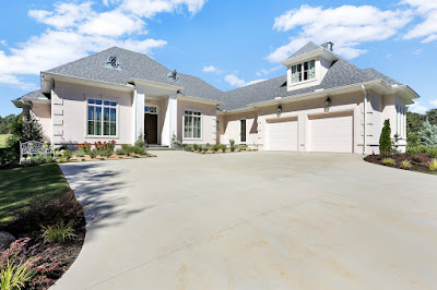
 Everytime I think of this project, John Mellencamp plays in my head. These previous clients, and serial home builders/remodelers knew before I drew the first line that they would be painting the house pink. It's the softest hint of pink. At sunset, you'd have a hard time deciding if it was just "glowing" with the sky, but the hue has made the house instantly known in it's well established neighborhood.


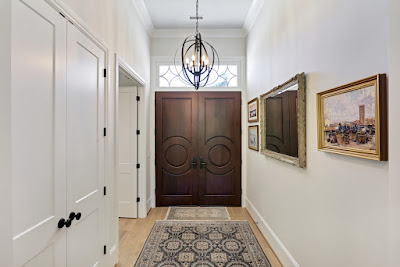
Love the details on the front door and transom.  


The office, located off of the foyer, features built ins and a comfortable sitting area.


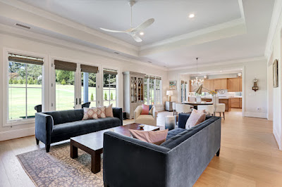
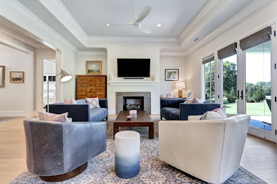
The center of the house is the large great room, which offers space for entertaining and dining. It opens to the kitchen, and offers access to the rear porch and a sweeping view of the golf course beyond.


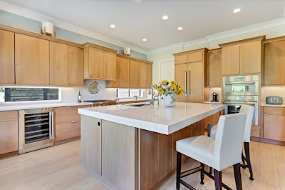
A closer view of the kitchen. Notice the windowed backsplash.

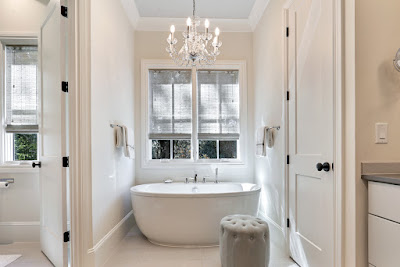
Luxurious Owner's Bath

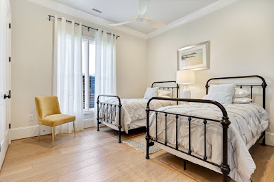
Love the iron beds in this guest room!

Beautiful view from the outdoor living space.

Tuesday, October 15, 2019

A Bright, Fun Lake House

This recently completed house on the shore of Lake Keowee, South Carolina, was not only built from our plans, but we provided interior design services as well. A soothing palette of white walls with black doors and windows provides a backdrop for colorful art and playful fabrics.

The front of the house features painted brick, timber accents, and touches of metal roofing.

The great room is bathed in  light. A board and batten accent wall gives texture and emphasizes the height of the vaulted ceilings.

The kitchen features a dark navy island, herringbone backsplash, and a range hood that repeats the wood accents found elsewhere.

The brick floor for the laundry room is not only visually striking, but practical.

The master suite enjoys a stunning view. Bright fabrics pop off of an all white scheme.

Black subway tile is punctuated with gold mirrors and light fixtures in the master bath.

One of the guest baths has a classic mosaic tile and black cabinetry.

A hallway is punctuated by colorful art and dramatic wall sconces.

One of the guest rooms carries the all white theme with bursts of color and pattern on the bedding.

Another take on the all white bedroom, again with vibrant accents.

The final guest bedroom also enjoys a lake view and a soothing palette.

The lakeside firepit is a perfect place to congregate.

The lakeside elevation showcases walls of windows and beautiful timberwork.

Sunday, June 30, 2019

Kitchen Refresh

Recently finished a project at my own house that I've wanted to tackle for years--an overhaul of the kitchen!

When the house was new, this is what the kitchen looked like:

It was a great size, but that's about all that could be said for it. Basic cabinetry. Cheap laminate countertops and linoleum flooring. Apparently, even cabinet knobs were a luxury the builder couldn't justify.

The walk-in pantry was a great space, but with just a few wire shelves, it was hardly optimal:


When I first moved in, we took it up a notch by adding some color to the walls, knobs to the cabinets, and some crown moulding:

Better, but it always left something to be desired. Because of it's size, doing much more always seemed daunting. (With over 60 cabinets and drawer fronts, even buying cabinet hardware was an expense!) So we lived with it for over ten years!

But for the past two months, we've taken it from dark and basic to bright and open.

First up was to tackle the pantry. A coat of paint, and new shelving and bins more than doubled the space available for storage:

It made sense to do the pantry first because it gave us space to store much of the "stuff" that we then took out of the kitchen while the renovation in there took place.

Over the course of six weeks, we replaced the black appliances with stainless steel ones, installed Cambria Torquay countertops, a white handmade subway tile backsplash laid in a herringbone pattern, undercounter lighting, new light fixtures, and new cabinet hardware. Finally, the original cabinet boxes were upgraded with new trim and everything was painted.

The walls are painted Sherwin Williams Mega Greige and the cabinets are done in their Agreeable Gray.
New glass pendants from Progress lighting are stylish and affordable.

The bar in the adjacent morning room was refinished to match the kitchen.
The color scheme was chosen because it felt up to date, but the paint shades still worked well with the earthier tones in adjacent rooms.

Monday, May 14, 2018

New Townhouse Project

Phase two of a townhouse project I designed has just wrapped up! Originally, the lot was mostly pavement and a house that had seen better days. We oriented eight units along a shared driveway, five of the units have street frontage, and three share a wonderful courtyard.

Drone Footage of the Project
The Three Units that open to the Courtyard 
The Foyers Feature Beautiful Wood Doors, Tray Ceilings, and Arched Openings
Open Living Areas Make the Most of the Available Space
The Kitchens Are Outfitted with Soothing Colors, Stone Backsplashes, and Quartz Countertops
All the Units have Large, Light-filled Bedrooms
Herringbone Patterned Floors Bring Interest To One of the Master Baths
Each Unit Features a "Drop Zone" near the garage entrance
Tile Details are Featured in Each Bathroom
Visit us on Facebook!

Wednesday, June 28, 2017

Before and After

Here's a little before and after of a sunroom we recently refreshed.

Dark walls, an undersized rug, and monochromatic drapery made the sunny room feel small and heavy.

 After: A painted beam and shiplap ceiling was added. The existing club chairs were reupholstered, and a skirt added to give them a more tailored look. New drapery (from Thom Filicia for Kravet), and a fresh new wall color (Mega Greige from Sherwin Williams) and a larger, brighter rug, make a huge difference!

Thursday, February 23, 2017

New Custom Home

A three level custom home we designed last year is wrapping up this week, and features a lot of nice features we wanted to share with you.

The great room has a wall of arched windows overlooking the pond at the rear of the property.
The kitchen is highlighted by timber beams and a sculptural range hood flanked by open shelves.
The formal dining room has a beautifully coffered ceiling.
The master bedroom' tray ceiling has intersecting timber beam work.
In the study, a door is hidden in the judge's paneling.
The master shower is accented with herringbone patterned marble.
For more photos of our projects visit us on Facebook!

Tuesday, February 7, 2017

A Whole House Renovation

Several years ago, I designed an extensive expansion and renovation to a lackluster ranch house in a fantastic old neighborhood. One of the images that has been "pinned" most to Pinterest from this site is the schematic drawing of that house. (The original post is HERE.) Thought it was way past time to share some actual photos!

A little "before and after" of the front. The house went from 1600 square feet to nearly 5,000.
A close up of the new entrance. Wide front steps, gable end trusses, and large columns with bracketed details create a sense of arrival.
One of the original bedrooms became the formal dining room, with tall wainscoting and coffered ceiling.
A new master suite was added at the rear of the house. The bedroom features another coffered ceiling.
The new master bathroom.
The new stair hall overlooks the back yard.
A large vaulted living space on the second floor separates the two children's suites.
The owner's son enjoys this spacious vaulted bedroom.
While their daughter's room is Princess-perfect with a double tray ceiling.
Another suite is tucked under the roof over the added garage. Interesting ceiling lines give it a lot of character.
A large covered porch with stone fireplace expands the main level living area into the outdoors.
This view of the rear highlights the challenging slopes the project presented. The alley-entry garage is actually a half story above the main level of the house.
A final shot of the new front. The beautiful landscaping finishes everything off.

Visit us on Facebook!