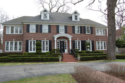
By now, the listing of the "Home Alone" house has been covered in dozens of places. (Had I been able to drop what I was doing and blog about it a few days ago when a friend called to whisper that it was for sale, I would have been one of the first to do so...so a special thank you to that friend for thinking of me and my lil ole house blog.)
The "Home Alone" house is in Winnetka, Illinois--a tony northern suburb of Chicago. If you ever travel to Chicago, and are the sort of person who loves a little architectural tourism, you owe it to yourself to head north out of the city on Sheridan Avenue and just give yourself a few hours to get lost in the northern suburbs that lie just outside the city along the lakefront. (Winnetka and Glencoe standout in my mind as must-sees) These towns are chock full of exquisite residential architecture--including the "Home Alone House."
The classic red brick Georgian house was built in the 1920's, and looking at photos from the current listing and comparing it to photos from nearly 100 years ago, not much has changed outside:
But why would anyone WANT to change the exterior of this house? Georgian houses like these are my absolute favorite. There is something so solid, timeless, and undeniably "homey" about the traditional "five over four and a door" style. John Hughes probably agreed when he chose this house as home to the McAllister family in the string of Home Alone movies. If you'd like to see photos of the house from the movie, Julia at Hooked on Houses has a wonderful collection of those images showing the house in all it's red and green wallpapered bliss, HERE. Julia also features a floorplan of the house that someone had worked up based on the movie. Compare it to this floor plan from current listing information, and you can see that the movie set very closely follows the floorplan of the real house:
Not a bad floorplan for a house that's nearing it's 100th birthday, but I think it could be better. (Maybe a new pre-designed plan from Southgate? Hmmm...) First, I hate that the laundry room is on axis with the front door. I realize that it's very unlikely that was always the laundry, but who wants company to see their dirty unmentionables lying on the floor waiting to be washed when they open the front door? Not me. It also seems to be a waste of space that the basement stair and the main stair aren't stacked on top of each other. But, overall, the plan is great. The rooms are a comfortable size, and I rather like how each room opens up to the next. if the formal living room only had an opening into the back hall where that half bath is, this home would have no "dead ends" at all, making it perfect for entertaining, and (if you ask anyone under the age of 12) even more perfect for a game of chase or hide and seek.
Something strange is going on with the second floor plan included with the listing information. Notice those closets between the master bedroom and the sunroom? They seem to show a window that would be slap-up on the corner of the house, a SIXTH window in the main block. Clearly (and thankfully) such a window does not exist. Obvious inaccuracies aside, the second floor plan reveals the master suite to be most in need of some reworking. A bedroom, a sitting room, AND a sunroom? All while the owner's of the house cram their Chicago-necessary four season wardrobe into 4 foot wide closets and attend to nature's call and groom themselves in a bathroom that looks more suited to a starter home? (A bathroom so covered in brass I can't even bear to repost the photos here.) Uh, no, ma'am. The square footage is there to make this a proper master suite, and I'd bet the ink isn't dry on the closing documents before the new owners do just that. Hopefully, while the new owners are making over the master, they'll also do something about that wonky half bath of questionable purpose that the floor plans indicate near the secondary bedrooms.
 |
| The Master Sitting Room |
 |
| Master Bedroom |
The most remarkable thing about the interior of the house is, well, how unremarkable it is. While the cove moldings in the foyer and the dentil molding and pilasters in the formal living room are deeee-lish-us, I honestly would have expected to see more woodwork in a house like this. The rest of the rooms are rather modestly trimmed, and frankly, a little boring. I can only assume that the current owners (who have lived in the house over 20 years, and owned it at the time it was used in the filming of Home Alone) have stripped away many of their belongings in preparation for selling the house. It just looks a bit empty, doesn't it?
That kitchen is fine as it is, but the glossy white cabinets seem a little low-buck, and while I can appreciate a hanging pot rack in SOME kitchens, the one hanging here looks more like some sort of torture device. I think finer cabinetry and detailing (like that gorgeous bordered wood floor!) would make the kitchen much better. So while I think the interior could use some updating, I imagine that any new owner who has $2.4 million to spend on it can surely afford a few hundred grand more to build on the incredible, timeless, and perfectly proportioned bones of this famous house.
Join us on Facebook!


Great post, I love these older homes, so much character. Love your blog btw
ReplyDeleteThanks Kathy! I agree...wish more of the houses being built now had the detailing of these great older ones.
ReplyDeleteThis house looks same as in today!
ReplyDelete