Sunday, August 28, 2011

A Small Bathroom Update

One of the first projects I designed out of school was an addition for a dear friend of mine. She had inherited a two-bedroom, one bath home that her grandparents had built in the 1970's. What had been a perfectly efficient home for retirees was way too small for a young family. We designed a new master suite and family room to expand the house, and those rooms served them well for eight or nine years, but it was time for an upgrade.

The original addition had been completed on a tight budget. Vinyl flooring, out-of-the box prefab shower, and inexpensive cabinetry kept the original bath costs low. But it was time for a major upgrade. The original shower was a neo-angle fiberglass affair that provided no elbow room. It was so tight, even the water was looking for an escape--a slow leak around the shower had caused some serious rot in the floor system.

The original bathroom was in need of an all-out update.

Expanding the footprint of the bathroom was out of the question for a number of reasons, so we had to work within the existing 7 foot by 8 foot footprint. The top of the homeowner's wish list was "the biggest shower you can give us."

The new floor plan called for a much larger custom built shower with half walls and glass. The existing fixture layout still seemed to make the most sense, and it helped the budget to leave everything in it's original location.


But the locations were all we kept. Here, you can see the exterior wall of the original house after the bathroom was demolished.


Drawing from other renovations they had completed, my friends wanted to see a lot of sparkle in the new bathroom. They had installed glass tiles in their other bathroom the year previous, and loved them. So generous use of glass tile was definitely part of the palette for the new master bath.


After. Gone is the claustrophobic angled shower. Replaced by a sumptous custom glass and tile one. High end finishes and fixtures are a 180 from the previous. The floors in both the shower and the main bathroom are an absolutely gorgeous natural green slate that perfectly compliments the glass tile accents.

The custom espresso stained vanity gives them more storage than the old unit. We struggled with what to do the countertops in. Every natural stone we tried seemed either too white or too yellow to work with the Kohler Memoirs sink. In the end, the glass countertop was the perfect solution. This picture shows a  hint of the slate floor.

A closer look at the glass countertop.

One more look. The nickel framed mirror and contemporary lighting are the perfect final touches.


As always, I am linking to the Metamorphosis Monday party at "Between Naps on the Porch"--they bring together the most amazing transformations on the web every week. Click over there to check out more. And be sure to join us on Facebook! 


Tuesday, August 23, 2011

A Little Something in the Works

Front Elevation

The Main Level Floor Plan


The Upper Level Floor Plan


And the Lower Level Floor Plan


I'll be writing more about this house, but for now just enjoy a little floor plan porn--14,000 square feet of it to be exact.

Join us on Facebook!

Monday, August 22, 2011

Going Up

There may be no architectural element on the interior of a house more important than the staircase. It's often positioned such that it's the first thing guests see when they enter. Mothers daydream of their daughters sweeping down a dramatic stair on prom night. Family photos are staged along their risers. Even the most humble staircase is more than a means of traveling between floors. So here's a look at some of my favorites.

Love how the balusters connect on this stair.

Gorgeous limestone and iron stair (via The Enchanted Home)

I adore a classic black and white floor! Great ironwork here. (via The Enchanted Home)

Crisp paneling and a simple railing make a beautiful first impression. (via Traditional Home)

What is not to love about this space?

Dramatic stair by Norman Askins. Beautiful inlaid floor.

Another Norman Askins stair, love the detail along the stringer.

Stunning front door and paneling in this home by Gabriel Builders.

A "haint" blue ceiling and stunning skylight crown this stair.

The seagrass runner keeps these double stairs from feeling too formal.

Great double split stair provides interesting views through the house.

A flawless curving stair by Robert A. M. Stern

Another by Stern...does this one remind anyone else of Auntie Mame?

A sweeping stair, a rotunda, and black and white floors? I have died and gone up the Stairway to Heaven. (via Whitehaven)

So which is your favorite? Do you have any special stairway memories or traditions?

Join us on Facebook!

Sunday, August 14, 2011

Remaking the Ranch House

Over the years, I've had the opportunity to be involved in the renovation of a number of classic ranch houses. The ranch house enjoyed it's heyday from the late 1950's through the late 1970's. Today, they are often located in established neighborhoods, and are attractive for the convenience of one-level living. But that's often as far as their attractiveness goes. Small, outdated kitchens and baths are common, closet space is lacking, and time has often taken a toll on wooden trim, siding, and decks.

Most ranches were built at a time when formal living rooms and dining rooms were still expected, a master suite was little more than a larger bedroom, and while there were no rooms above to keep ceilings low, it's rare to see anything higher than the standard eight foot ceiling anywhere in a ranch. So over the next few weeks, I will be sharing several ranch house renovations I have worked on.

The first is a house I actually worked on twice. The first time, the house had recently been bought by a young professional. I helped him clear away acres of carpeting, 96 rolls of metallic 1980's wallpaper, and assisted in selecting the "staple" furnishings. A few years later, the homeowner was married with a young son, and a daughter on the way, and they contacted me again (shortly after I had joined the architecture firm of Design Elite) to discuss some additions. Their initial wish list was short--a better master suite and a family room they could see the pool from.

The house had already been added to over the years. The original garage had been converted to a family room, and the master suite had been expanded. But these original additions were poorly executed and were already dated. Like many projects, the wish list grew. With renovations, it's often like pulling a loose string on a sweater...before you know it, all you're left with is a pile of yarn. And that was certainly the case here. Let's take a look at the house prior to the renovations:

The house was a pleasant but dowdy ranch, with no particular style. The lady of the house wasn't far off of her description of the house as "a giant double-wide."

A close look a this wider shot shows the break in the roofing at right where one of the original additions was made.

The owners had put in a gorgeous salt water lagoon pool and extensive landscaping that our renovation would have to respect. The weathered screened porch was the only place they had to enjoy the backyard from...something our renovation would need to solve.

This view of the original kitchen was taken when the owner first bought the house. This was among the most attractive wallpaper in the house if you can imagine.

This is the original floor plan. Large rooms, but not enough of them for the growing family. A general lack of detail and poor connection to the outdoors needed to be addressed.

Because it was also time to replace the roof, and the original siding was deteriorating, the builder commented at one of our first meetings that he would be "plucking the house like a chicken." And he wasn't lying. The planned demolition was extensive enough, but discovered rot, termite damage, and water intrusion, meant there ended up being very little but the studs left of the original house.

After a year of planning and construction, the owners had the house they wanted:

A new front porch gave the house a sense of arrival. Stone foundation work and variety of materials and roof forms meant the "big double wide" look was long gone.


Out back, the new family room and master suite overlook the pool, and two porches (one is just out of the camera's view) allow the family to enjoy their backyard.

The kitchen was widened, raised, and opened to the new family room. Some of the most important space added in this renovation was the vertical space. The low ceilings of the original house are gone--replaced with coffers and vaults.

The new master suite has a multi-tiered tray ceiling, a wall of windows overlooking the back yard, and an alcove that featured a window seat, morning kitchen, and access to the study (the husband had requested easy access to his home office from the bedroom)


The new master bathroom features tons of built-ins, a huge shower, airjet tub, and a tray ceiling.

Throughout the house we added thickened cased openings, wainscoting, and deep crown moldings.


The "after" floor plan highlights the large master suite, a more conveniently located laundry room, and the expanded living space. The irregular footprint was dicated by the existing pool and a desire to preserve existing mature trees on the site.

To keep the hallways from seeming like a maze of narrow passages, we created a small rotunda with a high tray ceiling to act as a hub and to provide visual relief.


The additions added only 1200 square feet, but the house feels much larger owing to the higher ceilings and site lines that were created.


I'm linking to the Metamorphosis Monday party at Between Naps on the Porch! Click over there for more before and afters. And check back here for more ranch house redo's.

Join us on Facebook!

Saturday, August 13, 2011

Poolhouse Plans

I was recently hired to design a poolhouse structure as part of a family's backyard makeover, and posted some serious poolhouse eye-candy here on the blog a while back. Since then, I've noticed a lot of search engine traffic for people searching for poolhouse ideas and plans.

If you've got a pool, you already know why a poolhouse is a great idea. Providing swimmers with a bath and kitchenette outside means less wet feet trampling through the main house. I've seen some poolhouses that were little more than sheds for housing pool toys and chemicals, and some that were big enough for a family of six to live in full-time. This design lies somewhere in between.

The exterior is a combination of brick, stone and timber. The central open-air living space is framed with gorgeous timber truss work. An outdoor fireplace features an inlay of herringbone brick, and the entire structure is skirted with a stone foundation.


The plan shows a large central outdoor living space. A cathedral ceiling framed with timber makes this a dramatic addition to your home and provides shade for when the sun gets too hot. To one side, a small, fully equipped kitchen means poolside snacks are just a step away from the action. And a large bath and changing room is conveniently located. With built-ins for storage and a walk-in shower for cleaning up after a swim, this bath is a perfect pit stop for pool parties.

Interested in the plans for this poolhouse? Then please contact us at southgateresidential@gmail.com

And find us on Facebook!


Our First Giveaway--Win a Subscription to Traditional Home Magazine!

Traditional Home has always been one of my favorite shelter magazines, and it is one that has luckily weathered the recent storm that has shuttered some of the oldest names in the industry. Now, as our first giveaway, we will be giving two lucky winners a one year subscription to the magazine. Entering is easy!

1. One entry--go LIKE Southgate on Facebook! (Those of you who already LIKED us will be entered automatically.)

2. Another entry--Follow our blog on Google, or add us to your blogroll. (Leave a comment on this post letting us know you have!)

3. Another entry--mention us on your own blog, Facebook wall, Google + profile, or Twitter. (Leave a comment here letting us know)

Blogger has had some commenting issues lately, sometimes it takes two or three tries before the comment "sticks". They promise they are working on the problem, but if you find yourself unable to leave a comment here, just let us know on Facebook.

Each person may have up to three entries, and on Monday, August 22, 2011, I will use random.org to choose two winners.

Good luck!

Sunday, August 7, 2011

Time to Decorate the Master Bedroom

The one room in this house that has gotten very little attention has been the master bedroom. We only sleep in it, and no one ever sees it, so it has been low on the list of decorating priorities. Other than a coat of paint, it has been completely neglected.

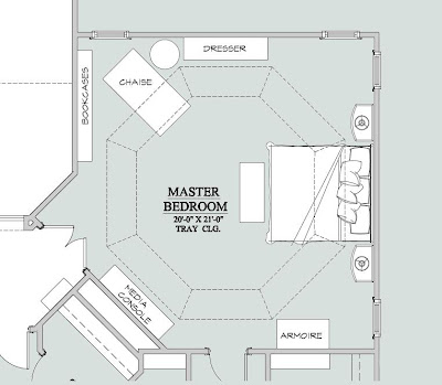
It's an overwhelming space--it's about a 20 foot square with 10 foot tray ceilings, and four individual windows. We currently have a king sized bed, two nightstands, an armoire, and a dresser in the space, but it's not nearly enough furniture to fill the space. My thought is to add bookshelves, a chaise, and a media piece, but I am not sure what finish to get the additional cased goods in. The current furniture is a blonde color that isn't available anymore. While this furniture wouldn't be my first choice now, it's the right scale for the room, good quality, and I just can't justify replacing it. At the same time, I'm certainly not going to buy any more pieces in that finish. But I'm scratching my head as to what finish the bookcases and media console should be so that the room flows together.

Have a look:


The head and footboard have a fabric inset, and I think if I reupholster that it will give the furniture a whole new look. The walls are painted Sherwin Williams "Svelte Sage" the lowest portion of the ceiling is Sherwin Williams "Ancient Marble" and the highest portion of the ceiling is Sherwin Williams "Connected Gray."

Here's a panoramic view of the other side of the space:


That blank wall will, according to my current plan, be home to some nice bookcases. We'll get a  bigger TV and place some sort of piece under it there on the left. My dilemma, if the new pieces don't match the old, is that the sensible arrangement will result in the furniture on one side being one finish and the other side being another--rather than two finished mixed through the room as I would prefer.


So, here's the furniture plan I've come up with so far. (Still leaves one of the corners looking awfully blank, but I think draperies will take care of that.) Like I said, the bookcases and media console will be a different finish than the rest most likely, so it bothers me that they are lumped together and everything in the blonde wood is on the other side of the room.

With the green-gray walls being as much color as I generally want in my own bedroom, I am leaning toward doing all of the drapery, bedding, etc. in creme and brown only. I fell in love with the following fabrics:


The center fabric would be the draperies. The toile on the right would be the duvet cover. The fabric on the left would be for accents and possibly the insets on the head and footboard. Shams and throw pillows for the whole space made of all three fabrics. We'll also be putting in a chandelier, but I have yet to find the perfect one for this room. I need a wide but not terribly tall one, preferably in a nickle finish.

Would love to hear some suggestions--am I wrong to go so monochromatic with the fabrics? What finish for the new pieces might compliment the current furniture? The rest of the house fell together (at least in my mind) very easily, and I'm struggling a bit with this room. Help!


Join us on Facebook!

I am linking to the Met Monday party at Between Naps on the Porch!

Tuesday, August 2, 2011

TV/Movie Houses: Bill Compton's Mansion on "True Blood"

Are you a fan of "True Blood?" I have to confess that it's one of my guilty pleasures. The books are the sort of mindless easy reading I love to have on the nightstand, and the TV show carries on HBO's legacy of beautifully produced television.

This season, one of the main characters, Bill Compton, a vampire who has been on the earth since the time of the Civil War, has become the Vampire King of Louisiana. So that he has a home befitting his new status, Bill remodels the antebellum house that has been in his family for generations. The set decorators gave us a video tour over on HBO (check it out HERE) and explained Bill's new digs.

When the series started, Bill's house is timeworn, having been abandoned for many years. In the books, Sookie (the main character for those of you who aren't True Blood fans) helps Bill with construction arrangements (since he can't very well be out and about during the day). Here are a few shots of what Bill's house looked like originally:

Notice the peeling paint and the general feeling of neglect.


Someone had their work cut out for them!


But check out the afters...absolutely delicious:

The master bedroom is very masculine. Dark colors, geometric patterns, and drapery made from men's suiting material. The red rug provides a dash of color, and I can't help but wonder if it's an allusion to the show's title.


Another shot of Bill's bedroom. Throughout this set, the designers have done something that I absolutely love--mixed traditional pieces and architecture with more modern ones. Makes for a very sophisticated look.

Very traditional paneling pays homage to the house's antebellum roots. The light fixture here feels like an abstracted version of an antique chandlier.


Bill's office is to die for (no vampire pun intended.) The muted, masculine color palette, the built in bookshelves, the blingy light fixtures...swoon!

Now I know quite a few people are looking at this photo and thinking "what office?" But look past the handsome vampires and dig the art he has. The tone one tone wallpaper. The chrome bits. All mixed in with a traditional globe and chest. If "Frasier" had premiered in 2011, I can't help think the set would look a lot like this.

The foyer continues the theme. Very traditional architecture paired with fine items from a variety of eras. I just love it!


That living room from the first photo looks quite a bit different here! The neutral colors let the lines and texture of the furniture make the statement. The black mantel, detail on the drapes, and framework on the wingback chairs give the room some punch.

The set designers accomplished something that is somewhat difficult. It's quite hard to design a space as polished as this one and have it come off so distinctly masculine. Too often, cliched themes (hunt club, anyone?) creep into the design of men's spaces...but they have created an urbane and sophisticated house that I, for one, could move right into.

Join us on Facebook!