Monday, January 23, 2012

A Few Projects at my Own House

A few weeks ago I shared the in progress redecoration of my foyer. (That post is HERE.) Well, after two and a half days of acrobatics high above the floor, the foyer is all done except for a few touch ups. I'm very pleased...it brings the high foyer down to a much more human and inviting scale. We painted the outside corners of the design in a color that is a shade or two darker than the wall color (we have also used that darker accent on a niche and our fireplace) The center area of the molding was papered with a tone on tone damask that repeats the two colors. (A hint of bronze metallic throws off the color a bit in photos.)

Forgive the quick cell phone pictures, will take some better ones soon.


Before, tall blank walls that begged for SOMETHING.


During the redecoration--trim was in place but unpainted. Was already an improvement!

After, with accent paint and paper all done!

This would have been a very easy DIY project if not for the height of the room. (Or if we'd had proper scaffolding to work on). We plan on doing something similar in our two story great room, and at least there we won't have to dangle out over the stairs!

My decorative New Year's resolution was to finally do something with our long neglected master bedroom. Other than painting it last summer, not a thought has been given to that space. So while the trim guys were doing the foyer, I had them install crown in the bedroom, and right after Christmas we found the perfect chandlier, which we put up this weekend. Still needs a lot (drapes, a few pieces of furniture, etc.) but it already feels much better:

Master Bedroom in progress. If anyone has some ideas for this room, I am all ears! Still haven't quite gotten my vision for what it should look like once it's finished.

I am linking to the wonderful Metamorphosis Monday party at Between Naps on the Porch!

Join us on Facebook!


Tuesday, January 17, 2012

This Weeks Find--Pratesi at Homegoods!

A Wall Street Journal article summed up Italian linen house Pratesi pretty well: "Pratesi is the Chanel of bedding. It's a label synonymous with everything posh: flawless fabric, a historic design archive and top-drawer clients. For three generations, the linens dynasty has had a lock on the high end of the market and its customers have included everyone from Liz Taylor to Stella McCartney. Even the notoriously picky Michael Jackson demanded only Pratesi sheets for his houses."

What makes a Pratesi sheet so special, aside from the ability to brag that one is slumbering on the same bedding as royalty?  Simply put, they are exquisitely made to last a lifetime. Made only from the first spinning of a special Egyptian cotton that produces 4-6 inch long fibers, a Pratesi sheet (or any sheet made from similar fiber) is much smoother than a "regular" Egyptian cotton sheet made from shorter fibers. (Pratesi also offers linen sheeting, an acquired taste I won't attempt to address here.)


The Pratesi signature is embroidery--all of the simply outlined "hotel" sheets that have popped up on every shelf in the world are quite simply knock offs of what Pratesi has done for over a century. 


Perhaps the best known Pratesi pattern is the oft-copied classic "3-line"

Another of their crisp embroidered patterns.

So what does a set of these luxurious sheets cost? Well, a king sized set of cotton 3-lines runs around $1500. No, I didn't put an extra zero in there. A linen set is even more, and the more elaborate embroidery patterns are also more expensive.

So imagine my shock and joy at finding a set of Pratesi sheets at Homegoods for just a little over $200. They unfortunately do not have the signature embroidered lines, mine have a simple "Pratesi" logo stitched discreetly in the corners, but they are nonetheless HEAVENLY. A quick search online reveals that others have found Pratesi duvets at TJ Maxx/Homegoods/Marshalls recently too--so you may want to RUN to your nearest location and see if you can score this unbelievable find!

Sunday, January 8, 2012

The Woods Lake--A New Cottage Plan

The latest design in our collection of small homes and cottages is The Woods Lake, which offers fine details and cottage charm in 1,000 square feet of living space.

A variety of materials, heavy timber bracket work, and a rooftop cupola lend charm to the exterior of The Woods Lake.


The floor plan features a host of "just-right" sized rooms, including a beamed ceiling great room, dining space encased in built ins, and a master bedroom with coffered tray ceiling. A convenient office nook and tons of carefully planned storage make the most of the small square footage. The oversized one car garage allows for even more storage and space for hobbies.

For more information or to purchase the Woods Lake plans, please CONTACT US


A Couple of Quick Ideas for Your Walls

The builder of my neighborhood has recently put up a new model home. It's a welcome site, after a few "quiet" years of construction, a half dozen new homes have popped up over the past few months, and it's nice to feel like we might finally be shrugging off this horrible economy.

Overall the house doesn't do much for me--it's a traditional sort of house that they have forced some crafstman-type details onto, and while it is a large home (almost 4,000 square feet) it doesn't flow all that well so it feels smaller, there were a few ideas that I was able to get from a quick tour of it today.

In a bedroom that was clearly staged as a "little boy's room", there were two great ideas for art. The designer's had hung a collage of framed comic book covers over the bed for a striking focal point:


The same idea could be applied in a number of ways--imagine the same look but with vintage fashion magazines. Or perhaps even some beautifully colored calendar pages?

In the same room, they had given three more framed covers some added "oomph" by hanging the center cover over a larger mirror:


I thought this was a great and unusual way to add some visual weight to a grouping. I may have to steal this idea for one of my guest rooms! Or imagine doing something similar with a pair of undersized prints that you love but haven't been able to hang.
Join us on Facebook!

Monday, January 2, 2012

What To Do With High Walls?

I hope everyone had a fun and love filled holiday season this year, and that 2012 will be a fabulous year for all of us. The lack of posts the past month are testament to just how busy the season was for me. Between parties, decorating, travel, and shopping, the blog unfortunately had to take a back seat for a bit. But a new year is upon us, and I will do my best to return to our regularly scheduled blogging.

And first, a transformation is in the works at my house. Visitors enter into a two-story foyer with a bridge that overlooks the front door to one side and the great room to the other. While the volume gives the house a nice open feeling, the high walls have always been a challenge. What to do with them?

 See what I mean? Acres of blank wall space! 
 The other side of the bridge.

Pieces of art were the first answer I came up with, but anything large enough was prohibitively expensive, and I hated to invest in something that would be too high up to be truly appreciated. I've seen high walls like these treated with hanging quilts or tapestries, and that's certainly a good solution in some homes, but neither seemed to suit our taste. 

After touring a builder's model last fall, the answer was clear--molding and paint! The model we saw had a similar foyer, and they had created squares of molding and painted the inside of them a contrasting color. 
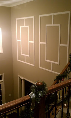
So I took some measurements, laid out some ideas, and for my partner's Christmas present, had installed these striking panels:

 The "L" shaped corners will be painted in the same darker accent color that we used on the great room fireplace and a niche in the foyer. The center squares will be wallpapered--we haven't found what we want yet, but it will likely be a tone on tone damask or geometric.

I was surprised just how big a difference these panels make, even before they are painted and papered. The whole scale of the space changed, it feels much more welcoming now. Even with professionals doing the work, the paneling was cheaper than buying art to fill these walls, and had I the patience and skill to install them myself, they would have been a real bargain!

This post is linking to the Metamorphosis Monday party at "Between Naps on the Porch" Visit them for many more inspiring before and afters!

And don't forget to join us on Facebook!